Part 1: Understanding the Basics
In this blog, we will learn about the significance of technical analysis and how it aids investors in making informed investment decisions. We will delve into various tools and indicators, explaining each in detail. This topic will be covered in 2 parts (2 different blogs), Each of the three parts will cover different topics but will include the basics of technical analysis, detailed explanations of tools and indicators, and case studies.
Introduction
Technical Analysis is a type of financial analysis that uses historical/past price and volume data to predict the future price movement of financial assets like stocks, bonds, commodities, derivatives, cryptos, and currencies. Technical Analysis unlike Fundamental Analysis is rooted in a belief that all relevant information is reflected in the asset’s price.
The Origin of Technical Analysis is said to be in the 17th century in Japan in the form of candlesticks, but it was Charles Dow, co-founder of The Wall Street Journal who laid the foundation for modern technical analysis in the 19th century. His theories on market behaviour and price movements are still relevant.
Three Philosophy Technical Analysis is Based On:
- Market Action Discounts Everything: This concept is rooted in the Efficient Market Hypothesis, which says that all known information about an asset is already reflected in the price. In other words, prices reflect all available information. Any new event or news is quickly assimilated into market prices. is assimilated promptly into market prices. This makes the price the best estimate of the asset’s true value at any given time.
- Prices Move in Trend: Charting aims to identify trends in the early stages of their development. A trend is likely to continue until an external force causes it to change. Trends are of three types: Upward (Bullish), Downward (Bearish), and Sideways (Consolidation). While trends are expected to continue, they change with time and circumstance, and chartists use chart patterns to catch these trend reversals.
- History Repeats Itself: It is believed that historical price movement trends will repeat themselves over time due to consistent market participant behaviour. Human behaviour and emotions are predictable and tend to recur in similar situations, this causes trends and patterns observed in the past to reappear in future. Technical Analyst often backtest their strategies using historical data to verify their effectiveness.
Key Components of Technical Analysis:
- Price Charts: Technical Analysts rely on price charts which plot the historical prices of an asset over time. These charts help them to identify patterns and trends and help to predict future movements.
- Indicators and Tools: Technical Analysis uses a variety of tools and indicators to analyse data and make a prediction. These could be patterns, moving averages, trendlines, RSI, MCAD and many more.
Difference b/w Technical and Fundamental Analysis
- Focus: Technical Analysis focuses on price and volume data, assuming that all information is reflected in the market price, whereas fundamental analysis focuses on a broader range of factors like financial health, macro/microeconomic, industry analysis and other growth factors.
- Time-Horizon: Technical Analysis is generally used for short-term to time the market for making entry and exit points. Fundamental Analysis is for long-term investing and assuming the intrinsic value of an asset over an extended period.
- Approach: Technical Analysis is more about understanding market psychology, and analyzing trends and price movements. Fundamental Analysis is about understanding the asset, industry, and economic factors that influence the asset.
Types of Charts
1. Line Chart:
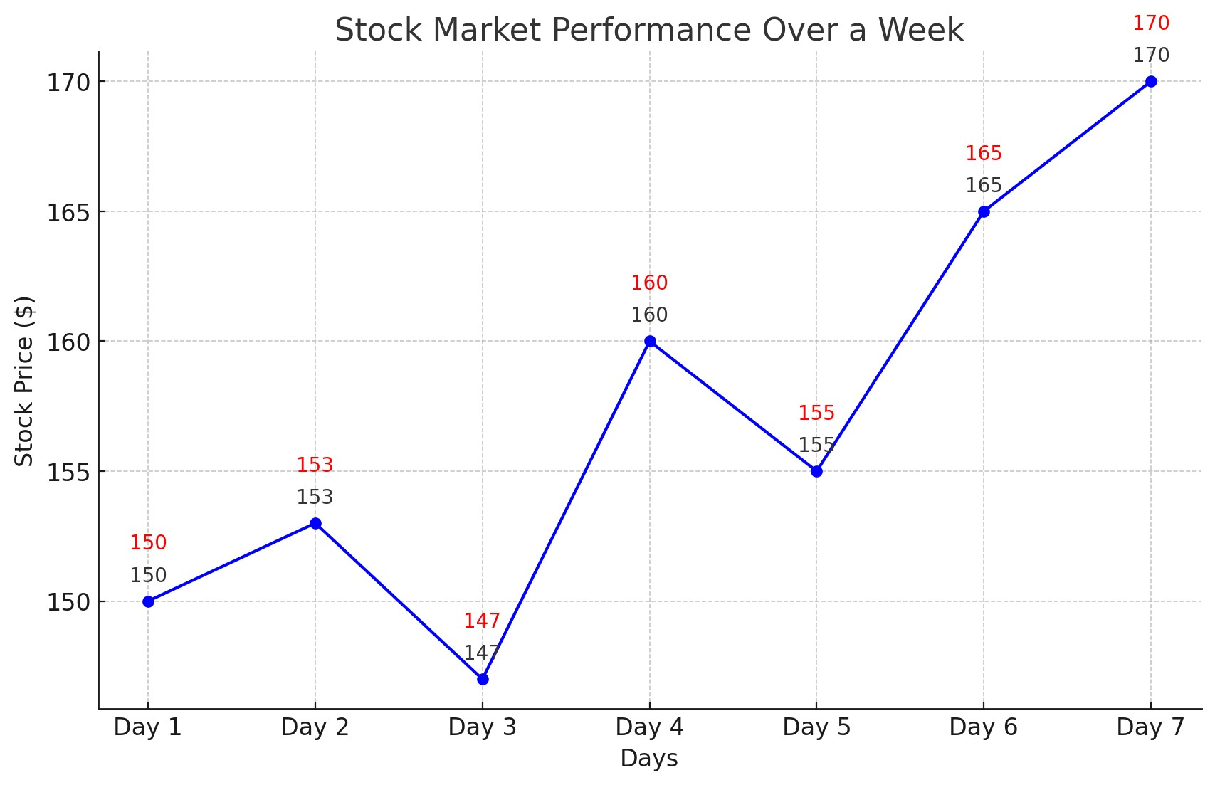
A line chart is a simple type of chart that shows data as a series of data points called “markers” and connected by a straight line. The line chart plots the closing prices of an asset over a period and each point represents the closing price at the end of the trading period.
The line chart is good for analysing trends and the long-term price movement of an asset. They are simple and less cluttered compared to other charts, making them beginner-friendly and have a quick overview. To read a line chart one can focus on trends, an upward slope indicates an uptrend, a downward slope indicates a downtrend, and a sideway movement indicates no trend or consolidation.
2. Bar Chart:
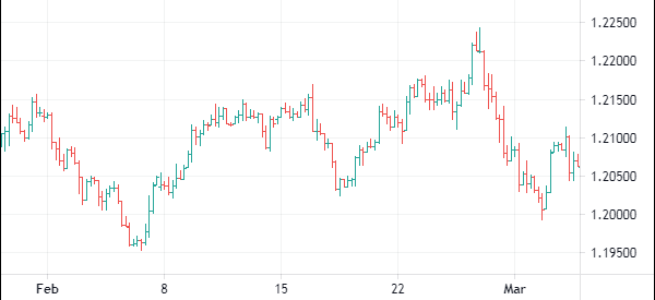
A bar chart is a graphical representation of an asset’s price movement, over a specified period showing Open, High, Low and Close prices. Bar Charts are useful for analyzing volatility and identifying entry and exit points based on trends and price ranges.
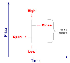
- Open: The left dash on the vertical bar shows the asset’s opening price.
- High: The top of the vertical bar shows the highest price of an asset during the period.
- Low: The bottom of the vertical bar shows the lowest price of an asset during the period.
- Close: The right dash on the vertical bar shows the asset’s closing price.
By analyzing the length of the vertical bar in the chart, a chartist/technical analyst can gauge the volatility in the asset for that very period. The longer the vertical bar, the higher the volatility and price range of the asset. The shorter the vertical bar, the lesser the volatility and price range.
3. Candlestick Chart:
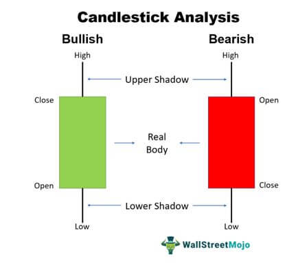
Candlestick charts are very similar to bar charts and show price movement over a specified period, each candlestick represents one period of data. Traders/Chartists need to analyze the candlestick body to understand the market sentiment and potential trend reversal. For example: A longer upper wick means there is selling pressure and a longer lower wick means buying pressure.
Source: WallStreetMojo
The rectangular body shows the opening and closing price of the asset for a period. If the body is red then the closing price was lower than the opening price, and if the body is green colour, then the closing price was above the opening price. The thin lines above and below the body of the candlestick are known as “wicks” or “shadows” representing the high and low.
A few common candle stick patterns:
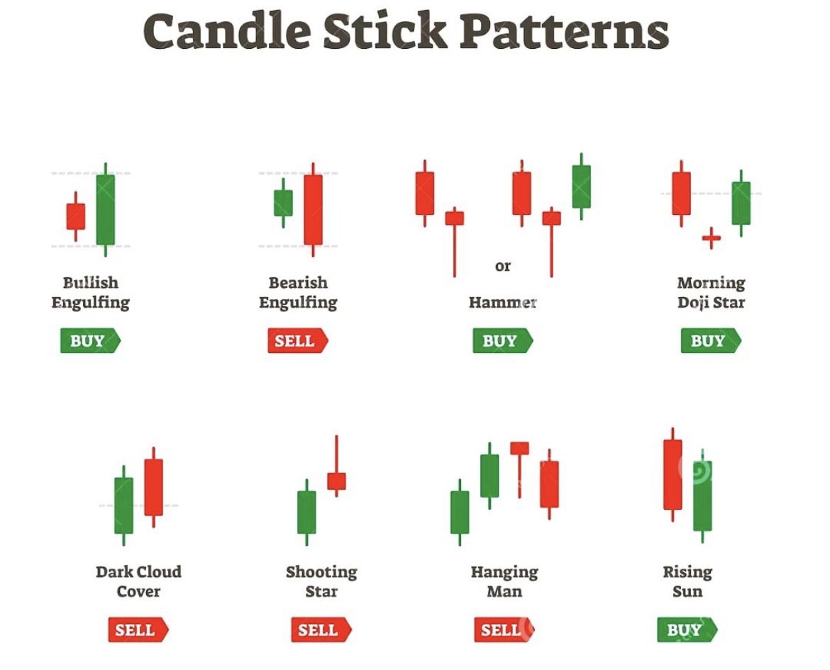
- Doji: A candlestick pattern with a small body and long shadows often indicates the market’s inability to make a decision. Often when found at the top or bottom of a trend signs trend reversal.
- Hammer and Hanging Man: During a downtrend if a hammer forms it indicates a trend reversal. Similarly, during an uptrend, if a hanging man forms it also indicates a trend reversal.
- Engulfing Pattern: When a smaller-size bearish candlestick is covered by a bigger bullish candlestick we call it engulfing pattern, this pattern may suggest a bullish reversal. And similarly, a bearish engulfing pattern indicates a bearish reversal.
Trend Analysis
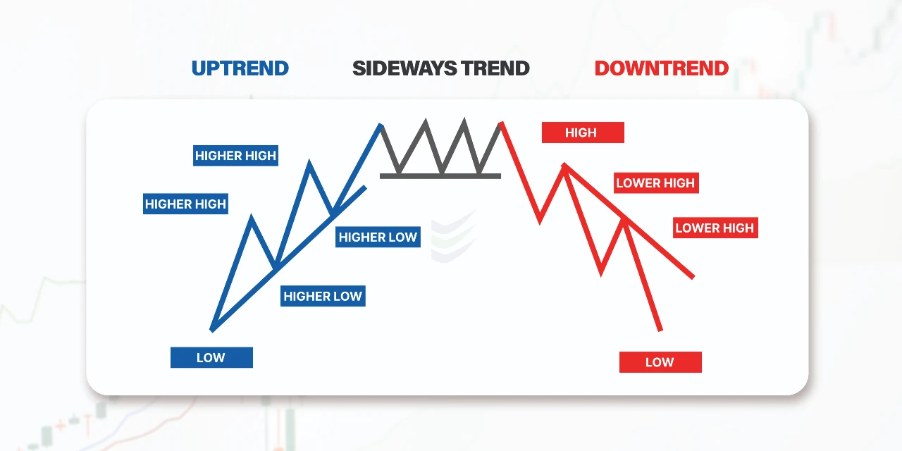
The fundamental of Technical Analysis is to analyze and understand trends and channels. Trends are very important as they help the trader to gauge the direction of the market and to make better decisions. There are 3 primary trends:
Source: enrichmoney
- Uptrend Line: Uptrend means higher highs and higher lows, where the price of an asset keeps increasing. An uptrend indicates a bullish market where demand is higher than supply. A chartist/Technician needs to connect a series of higher lows to draw an uptrend line, this creates a support that signals strong enough buying interest to keep the price from falling further.
- Downtrend Line: Downtrend means lower lows and lower highs, where the price of an asset keeps decreasing. A downtrend indicates a bearish market where supply is more than demand. A chartist/Technician needs to connect a series of lower highs to draw a downtrend line, this creates a resistance that signals strong enough selling interest to keep the price from rising further.
- Sideways Trend Line: The sideways trend line also shows consolidation of the asset’s price, it moves in a horizontal path, without a clear uptrend or downtrend. Sideways trends also indicate that neither the buyer nor the seller dominates the market and the market is in a balanced phase.
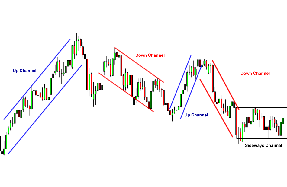
Channels:
Source: babypips
A channel is a combination of 2 parallel trending lines that gauges the price movement of an asset. Similar to trends there are 3 primary channels, Ascending (Uptrend), Descending (Downtrend), and Horizontal (Sideways Trend). These channels make a boundary on an asset’s price movement and indicate a trading zone within which the prices will fluctuate. With the help of channels and trendlines, chartists can come up with their own strategies, and therefore trends are fundamentally very important in technical analysis.
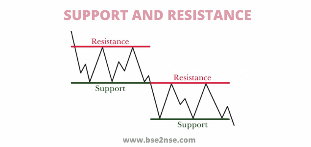
Support and Resistance
Source: bse2nse
- Support Level: It is a price point where buying interest is the highest and buying pressure keeps increasing with the decline in the price point. This strong demand helps the price of an asset from falling more and may result in a price bounce back.
- Resistance Level: It is a price point where the selling interest is the highest and selling pressure keeps increasing with the rise in the price point. This strong supply helps the price of an asset from rising more and may result in a price pullback.
There are multiple methods to determine key support and resistance levels:
- Analyzing Historical Price Data
- Moving Averages
- Trendlines
- Volume Profile
Support and Resistance play a very important role in Technical Analysis, as they give traders an added advantage to make better decisions and have a strategic understanding of the market.
Moving Averages
Source: Finviz
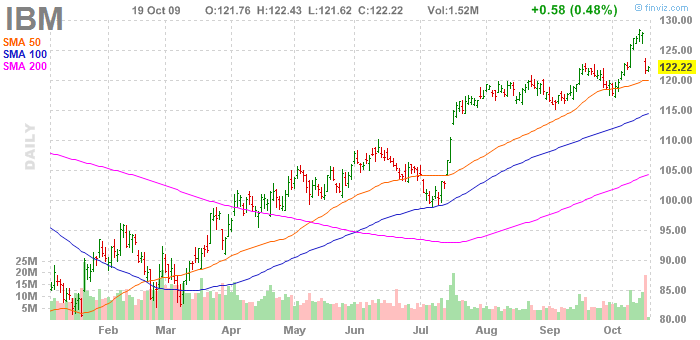
Moving Averages hold a lot of significance in Technical Analysis. It is used to smooth out the fluctuating price movement and understand trend direction.
- Simple Moving Average
Chartist uses SMA to identify the trend’s direction. A rising SMA indicates an Uptrend and a falling SMA indicates a Downtrend. The period can be adjusted according to traders’ preference to 10 days, 20 days, and 200 days to gauge short-term, and long-term views on the asset.

- Exponential Moving Average
EMA is very different than an SMA in a way that the EMA gives more weightage to the recent prices, unlike SMA which gives equal weightage to all the prices.
EMA just like SMA is used to identify trend direction but because it gives more weightage to the latest prices it is used for the short term. EMA’s can also be used for determining support and resistance levels, providing possible entry and exit points.

Technical Analysts can use multiple trading strategies using Moving Averages like
- Golden Cross Strategy
- Death Cross Strategy
- Crossovers of EMA
- Ribbon Strategy
- Envelopes Strategy
- May more.
Conclusion
In this Blog, we have covered the basics of Technical Analysis like Types of Charts, Trends & Channels, Support & Resistance, and Moving Averages. Each of these topics could be further detailed and we may do it in future blogs. With this blog, we wanted to give budding investors and traders an idea about technical analysis. In Part 2 of this blog, we will cover Momentum Indicators, Volume Analysis, Chart Patterns and will also learn how we can integrate Technical Analysis into Investment Decisions.

